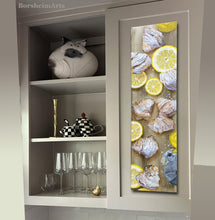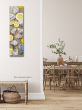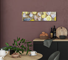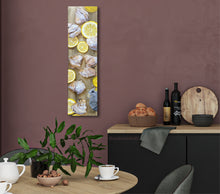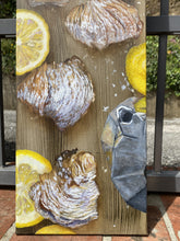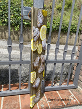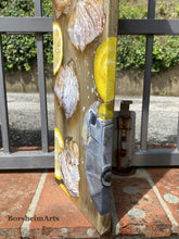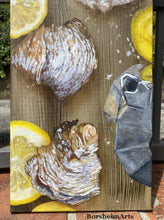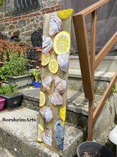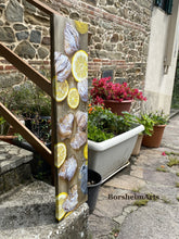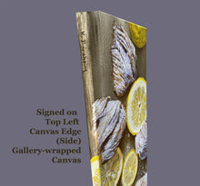
Lemon Slices and Sfogliatelle painting
- 80 h X 20 cm (31.5 h x 8 inches)
- Acrylic on Canvas
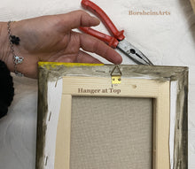
- Gallery-wrapped Canvas (wraps around the sides in case you do not want to use the frame)
- © 2024-2025 Kelly Borsheim
- Available
Inspiration and the Story behind this Vertical Still Life Painting:
In 2024, I received a commission to paint a tall, thin, vertical still life painting of an Italian breakfast for a new kitchen in Texas. After some back and forth idea exchanges with the collector, it was decided that I would paint her favorite Italian pastry, the Sfogliatella (singular; sfogliatelle, plural). Since lemon creme was her preferred flavor, but she did not want creme exuding from the pastry, I decided to add some lemon slices to some of the composition ideas.
I often use Photoshop to "collage" ideas, using a variety of found images. It makes it easier and faster when trying to communicate a visual idea, and much more efficient to take out this and add that, as we get closer to the final collaborative idea.
The lemons did not make it into the our project as we simplified the composition for a very elegant painting with a purple iris. The iris is the flower of the Renaissance City (Florence, Italy) where the two of us met (despite both having lived in Austin, Texas, long before we ever met) and held a special place in the heart of my dear art patron.
If curious, you may see the painting hanging in her kitchen here:
https://borsheimarts.com/blogs/news/destroying-art-and-inside-collectors-homes
The Next Italian Breakfast Painting:
However, I still loved some of the other ideas presented and decided that I would paint the painting you see here and offer it to anyone who would love to add it to his or her art collection.

I chose to paint the wooden cutting board background first. The result is better and the work far easier to paint something like wood grain, or in fact, the implication of such, without trying to paint around or up to the things sitting in top of it. I chose raw umber in acrylic paint, applied with a wide brush that was mostly dry as I added the layer of the wood grain. I want this painting to dry faster than an oil painting could.
I have lost a lot of my creative time since my accident in July 2023 and need some positivity in my life now. Yellow is a happy color, hahah. But I also thought this could be a calming project for me as I needed to regroup and figure out what I can accomplish realistically this year.

Having created a mid-tone background, and transferred my shapes to the canvas (in charcoal from my fireplace that I save when good), I usually start by adding in the lights. I know that I paint in layers and thus, I wanted to have more white paint in the first layers.

Can you see now what that is? Some of my acrylic paints are more transparent than others. Also, I tend to paint thin, especially in the beginning. Thus, I need the opaque white added so that you will not see wood grain in the food!
Even so, you can see that I do not just paint willy-nilly. As I paint, I also start the tonal design, distinguishing between shadow side and where the light hits the object the strongest.

Here is a fun aerial view of the first layer of painted objects. I still have to start the caffettiera or the specific design of the Moka, the uniquely shaped pot that makes coffee in most Italian homes. I happen to have two sizes (one for three people, the other only for single tiny coffee cups, as traditionally drunk in Italia). I do not often drink coffee, but have to keep it on hand for others who visit my home.

The shapes are the most important for the brain to identify. When I taught art, I created a demo of painting a purple pear. If the shape is readable as a pear, it does not matter what color it is: Your brain sees a pear. In the case of this still life food painting, I am creating the illusion of many individual pastries of the same type. Thus, it is far more interesting to have similar, but noticeably unique pastry shapes.

This vertical image shot in front of my caminetto (little fireplace/stove) gives me the opportunity to see the painting from some distance. Far easier to judge when I am far enough away to see the big picture. I self-critique throughout the entire creative process.

The paint gets thicker and at this stage, I want the direction of my brush strokes to add to the overall effect of the nature of the sfogliatella pastry: many fine layers. But I do not want to paint each one... I only want your brain to understand the nature of the delicious food.

The same concept goes for the powdered sugar that will go on top of these pastries. It is far easier for me to paint the pastries without the sugar on them than it is for me to paint the sugar as I see it in my photo reference, but then try to create a consistent color in the proper tone AROUND the white sugars.
It does help if you know where you want to go so that your foundation is a strong one. Processes fascinate me. How do you feel about them?
You may also note that I have started painting on the sides of the gallery-wrapped canvas. That gives the lucky buyer an option to frame or leave unframed.


Now, I know that the pastries have not been perfectly painted, but I need to move on because everything has a context. What I mean is that when I feel done enough with one part, I move on to another part, allowing myself the permission to return to find tune the art.

Here you may see how I stipple the sugar in place. The brush is short and cut straight across, allowing for the vertical pressure. I can twist or roll the brush in my hand to change the angle of the applied white paint. At this point, I also decided to add some violet to the shadow areas of the white powdered sugar. I like the contrast to the yellow.

You can see how the painting looks so much lighter in the glare of the sunshine, but I like to critique my work under different lighting situations.

You may also note that I sprinkled powder sugar around the cutting board. Anyone familiar with that sugar knows that it ends up everywhere!

Now for the really fun part: adding the shadows for extra dimensions. At first I used a burnt umber, but it was too warm. The shadow colors must relate to the object upon which the shadow falls. Thus, raw umber was the better choice.
The difference is that I switched to oil paint, which works well over acrylic paint. Why oil? Because acrylic is more like plastic, in the sense that adding too much water to acrylic changes the chemistry of the paint, making it weaker. And while some of my acrylics are somewhat transparent, nothing beats oil in that quality. Or watercolor, but that medium would not work well on top of acrylic. I need not only the transparency, but also soft edges. Shadows will be darker closer to the objects, while lighter further away. It is a delicate balance and acrylic, for me at least, dries too quickly to give me the effect I wanted.

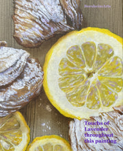
Finally, I wanted to play a bit with the yellow lemons by adding specks of lavender color in them. First impression: the color was too strong. But with mixing tones closer to the various yellows in the lemons, I came out with a better and more interesting result.
Do you like this?
If interested in adding Lemon Slices and Sfogliatelle to your art collection, please:


