
Art-vs-Science Turner and Rothko
Borsheim Art Newsletter: by Kelly Borsheim
Original copyright 1 March 2011
CONTENTS:
- Golden Times - JMW Turner
- Art vs. Science or Turner vs. Rothko
- New Marble Carving: "Back to Back"
- Events: Sculpture Challenge, 2011 Stone Carving Competition, Salon Competition
- Pastels in Paradise Workshop - Hawaiian Art Journey
- Blog Highlights
- Subscription Info.
Dear Art Lover,
Have you ever noticed that under certain conditions of sun and air the day seems to take on a yellow hue? I have only experienced this in my wooded home in central Texas, but I imagine that this gorgeous time happens in other places of the world as well. I call it the Golden Time, or Golden Days. It is often short-lived, but magical nonetheless.
I heard (or maybe read) somewhere long ago that a painting with too much yellow in it will never sell. Yellow, apparently, is a color of the intellect and therefore a "smart painting" could not possibly have the appeal to the buying audience. Imagine that! Like many absolute statements that I have heard ("There are only 25 human body types in all the world" and "Women look better with their arms over their heads" are other funny ones that come to mind), I find myself watching the world for contradictory examples. [And while selling artwork does not indicate its true success as a work of art, it certainly is a powerful statement and compliment that someone is willing to part with his money to obtain such. And of course, it is often the means by which an artist can continue his work.]
I took an informal study on both of my Facebook accounts. In general, people responded that yellow makes them happy. Not surprisingly, yellow calls up warmth and summer. A few admitted opposite feelings … uneasiness and caution. For some, it was a matter of context, with yellow being appreciated most as a small and unexpected accent for other colors.
I recently returned from a trip to London and was thrilled to finally see some of the original paintings by Joseph Mallord William Turner (23 April 1775 - 19 December 1851) at the Tate Britain. I doubt that JMW Turner needs an introduction to anyone reading this page. However, there is a first exposure time for every artist. So, let me just explain that Mr. Turner was an extremely prolific landscape artist from England. He left us with over 19,000 watercolors, drawings, prints, and oil paintings. He devoted his entire life to art, exhibiting even in his childhood, and was successful in his own lifetime.
I was surprised that his oil paintings were much smaller than I had assumed. Even the images I had seen on the Web and in books seem larger than life: Wow, what an impact! Here are some of Mr. Turner's paintings with varying degrees of yellow. See how they make you feel.


1835 Oil on Canvas @ 92 x 123 cm by JMW Turner


1819 Watercolor @ 22 x 29 cm by JMW Turner

1844 oil on canvas @ 91 x 122 cm by JMW Turner
One of my Facebook friends sent me this link regarding the meanings of yellow around the globe. Enjoy:
----------------
Art and Science:
As I have quoted before, my friend and mentor Vasily Fedorouk said that "The artist is the best kind of scientist because we study everything." Like my much earlier exploration of how music and literature used to be one art form, I wonder now about the separation or connection between art and science.
In my research about JMW Turner (1775-1851) and the Tate in London, I found a connection to artist Mark Rothko (1903-1970), even if it was of his own instigation. One page referring to a joint exhibition in 2009 of paintings by these two artists states:
"The links between these two artists are well documented. After visiting an exhibition of Turner's works at the Museum of Modern Art in New York in 1966, Rothko reportedly commented that 'This man Turner, he learnt a lot from me'. A few years later, Tate's renowned Turner Bequest was a major influence on Rothko's decision to donate nine of his Seagram murals to the Collection."
I generally do not like disparaging any artist (or person). After all, I feel very strongly that each person is the only one truly capable of expressing himself and his experiences in his own terms. That said, it rarely helps to blindly accept everything when it comes to trying to figure out for myself how I feel and who I am and what I want to express and why. I also am quick to point out that I am ignorant of a great many things, including the works and processes of many famous and non-so-famous artists. Part of this is by design, and part because of a lack of time. I also have a difficult time with labels and categories.
Paintings by Mark Rothko:

"No.9 - White And Black On Wine" 1958
oil on canvas by Mark Rothko

Title unknown (by Kelly)
painting by Mark Rothko

Tryptich painting by Mark Rothko

"No. 12" 1951
@ 34" x 31" painting by Mark Rothko

"Violet, Green, Red" 1951
painting by Mark Rothko

"Dark Brown and Grey"
painting by Mark Rothko

"Mural Sketch p 96" 1959 Seagram Mural Series
oil + mixed media painting by Mark Rothko
So, from this perspective, please bear with me when I say that I have yet to see the appeal of the work of Mark Rothko and other artists whose work strikes me as more of a scientific exploration of optics rather than fine art. I am told that the Rothko Chapel in Houston is beautiful and his works add to the contemplative nature of the space. I believe this could be true and also agree that the viewing environment of any work of art is important. I can imagine that the presence of many figurative paintings or complicated compositions could actually DETRACT from a space intended for meditation.
However, it strikes me that the difference between a Turner and a Rothko is the difference between art and science. Both artists were exploring emotional responses based on an arrangement of shapes and colors. So, where does one draw the line? Is that line important?
It interests me that so many artists seem to have developed their work based on an idea of what they did NOT want it to be. Meaning that it was more of a push away from something than a move towards something. Not true of all artists and certainly it is easier to determine what you do not want vs. what you do… but hmmm.
In reading Mark Rothko's bio, I could not help but wonder if his fear of anti-Semitism (as a person of Russian Jewish descent) and his possible deportation from America in a time of rising Nazism greatly aided his decision to create art that contained little recognizable visual imagery. He wanted to paint nothing that could be used politically against him. His work may have evolved in his mind into that simplicity becoming something more, but the paintings of Mark Rothko simply do not move me or even intellectually inspire me.
I do not get the impression that fear was even remotely a motivating force at any point in JMW Turner's career. Instead, he seemed proactive, not reactive in his work. He was seeking to portray something more romantic, more elusive, more honest, more spiritual than what he had been doing before. His artistic journey does not seem to be a response away from anything (or even in response to another artist's work) as much as it feels like an active yearning towards a different part of reality.
I have written before about Notan, a Japanese design concept in white and black, that can be used as a basis for a composition of a work of art. This design of shapes in only two colors will contain an idea, but I am not convinced that it will be the best expression of that idea. I suspect (and this is something that has been turning in my conscious mind for quite a while now) that the concept must be developed a bit more to give that element of je ne sais quoi or spirituality that we seek to achieve in our art. In essence, the geometrical design must morph in some way to change from science or mathematics into art.

"No. 61 - Brown Blue Brown" 1953
painting by Mark Rothko
"A Pink Sky Above a Grey Sea" c. 1822
guache + watercolor by JMW Turner

"Color Beginning" 1819
watercolor by JMW Turner

"Ochre and Red on Red" 1954
painting by Mark Rothko
Of the four images above, two by Rothko, two by Turner, I would go so far as to say that none of those would I consider art. They can be precursors to art, meaning that they look as if the artist is figuring out ideas that can be developed into art. These are notes, explorations, studies, the rough draft, but not poetry.
I do not mean to suggest that a work that appears obviously mathematical or even just symmetrical or balanced cannot be a work of art, but the compositions above do not strike me as having soul. Instead, they simply exist. In Mark Rothko's own words, I have apparently "missed the point." (see Wikipedia)
I also find it interesting that the later paintings of JMW Turner (see below) are powerful when viewed almost at any size. Mark Rothko felt that his paintings needed to be large with the viewer standing close so that the viewer could be overwhelmed by the color surrounding him. But this thought leads me to even more questions than answers.

"Burning of the House of Parliament"
painting by JMW Turner

The Morning After the Deluge" circa 1843
painting by JMW Turner

"Storm Clouds - Sunset with a Pink Sky" c. 1824
painting by JMW Turner

"Landscape with Distant River and Bay" circa 1840-50
94 x 124 cm oil painting by JMW Turner

"Procession of Boats with Distant Smoke - Venice" c. 1845
90 x 121 cm oil painting by JMW Turner

"Norham Castle - Sunrise" 1835-40
78 x 122 cm oil painting by JMW Turner

"Sun Setting Over a Lake" c. 1840
91 x 123 cm oil painting by JMW Turner

"Sunrise With Sea Monsters" c. 1845
92 x 122 cm oil painting by JMW Turner
********************************************************************
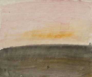
The image below and the two beneath it were taken by me with my little Sony snapshot camera while I was visiting the Tate Britain. I included them here since the full shot looked so different from the image that I found off of the Web (all of the Turner and Rothko images of their paintings [besides these three] came from various Web sites). This "Sun Setting over a Lake" may just have been my favorite of the Turner landscapes (or lakescapes?).

Here is what the Tate has posted about this painting on the wall next to it:
"This dazzling sunset scene contains all the characteristic elements of a late Turner painting. The blurry unresolved forms make it difficult to establish the details of the composition and the only clearly discernible feature is the brilliant yellow sun sinking below the horizon. It is important to note that the picture is unfinished and would not have been exhibited by the artist without a greater level of development. Nevertheless it represents a powerful meditation upon the glories and mysteries of the natural world."

"Sun Setting Over a Lake" (detail 1) c. 1840
91 x 123 cm oil painting by JMW Turner

"Sun Setting Over a Lake" (detail 2) c. 1840
91 x 123 cm oil painting by JMW Turner
I did not photograph the sign for "Sea Monsters" although that painting was next to "Sun Setting…" However, the next painting over was "Norham Castle, Sunrise" with the following explanation:
"The ruins of Norham Castle on the River Tweed in Northumberland was one of Turner's favourite views, so much so that he was observed bowing to the ruin, hat in hand, in a gesture of gratitude for the number of paintings it had inspired. Now one of the most popular pictures in the Tate's collection, this radiant oil study was part of a group of unfinished canvases which were unknown during the artist's lifetime. It was exhibited for the first time in 1906 when it was acclaimed for its impressionistic qualities."
So, they believe that the artist had not considered these later paintings finished. And yet, what emotions they stir up! These paintings ARE poetry and leaves me with that interesting question again… where does one draw the line between exploration and finished expression? A good idea manifests itself (or is created) early on in the process. The details are mostly bonuses. But really, I would love to have known what JMW Turner had in his mind to do with these "unfinished" canvases. Like Michelangelo's unfinished slaves: powerful work can have an amazing effect even mid-process. I wonder if sometimes it is stopping the work at a particular time in the development that actually makes the work more interesting. This is a good debate, worthy of consideration.
Some more links of possible interest:
- JMW Turner on Wikipedia: http://en.wikipedia.org/wiki/J._M._W._Turner
- Lots of Images of Turner's art: http://www.william-turner.org/
- Mark Rothko on Wikipedia: http://en.wikipedia.org/wiki/Mark_Rothko
- Rothko's Seagram Murals: http://unurthed.com/2010/07/19/rothko%E2%80%99s-seagram-murals/
- Understanding Mark Rothko's art: http://37signals.com/svn/posts/210-simplicity-clarity-being-understood-mark-rothko-etc https://signalvnoise.com/posts/210-simplicity-clarity-being-understood-mark-rothko-etc
- How Rothko ended up at the Tate: http://www.guardian.co.uk/culture/2002/dec/07/artsfeatures
- Interested in another artists' conversation about reaching the sublime in art? Check this out: http://artandperception.com/2007/07/wanderer-in-a-sea-of-foggy-ideas.html
----------------
New Marble Carving Back to Back:
For those who follow my blog, you will have noticed that I am currently carving a large Gymnast in marble. Many years ago I created a small maquette in clay so that I could determine the proportion of the stone that I wanted the quarry to cut for me. Because I do not have a diamond chainsaw, I asked the quarry to cut out a large section of marble from above the gymnast's head so that the stone would not be wasted. I have almost finished polishing the composition created from this smaller chunk of stone.
Making his debut this Saturday at the Sculpture Challenge in central Texas (see Events) is my latest marble carving of two torsos titled Back to Back. This figurative sculpture measures 14" tall by 9.5" by 9.5" and has some lovely grey and gold diagonals running through the white marble. I am often happy that the stone carving process takes me so long to complete because I enjoy seeing the shimmers and the form develop in many different lighting situations. I hope you enjoy this new piece.

----------------
Art Events:
Please join me this Saturday in Dripping Springs, Texas, for the annual "Sculpture Challenge" a fund raiser for PAWS Animal Shelter. Saturday 5 March 2011, Hours: 10 a.m. - 5:30 p.m.
CARVED STONE, INC., 5300 Bell Springs Rd. Dripping Springs, Texas 78620
Contact: Philip & Michelle Hoggatt Phone: 512-858-5665
Admission requires a $10 per person donation to PAWS. All ticket proceeds benefit PAWS. Also, if you purchase one of the sculptures entered into the Sculpture Challenge, 20% will go to PAWS. You may also find a furry friend for your home.
+++++++++++++++++++++
Coming in April 2011:
Greenhouse Gallery of Fine Art: Salon International 2011 International Oil Painting Competition
Awards Banquet: April 1, 6 - 9 pm ****Reservation Required**** (Contact Gallery)
Exhibit Opening: April 2, 10 am - 8pm (Free and open to the Public)
Exhibit continues through 22 April
Greenhouse Gallery; 6496 North New Braunfels Ave.; San Antonio, Texas 78209 USA
Tel. 210.828.6491 or toll free 1.800.453.8991
__________
9 & 10 April: Saturday 11 a.m. - 6 p.m.; Sunday 11 a.m. - 4 p.m.
2011 Stone Carving Competition and Fine Arts Festival
The Vineyard at Florence; 8711 FM 487; Florence, Texas 76527
Contact: KAMBRAH GARLAND at 512-924-7447 or ph. 254.793.3363
www.thevineyardatflorence.com E-mail: stonecarvingevent@gmail.com
The competition will be judged on Sunday afternoon at 2 pm by no less than 3 independent judges. Prizes for 1st, 2nd, and 3rd places will be given.
----------------
Workshop in Hawaii - April Date Approaching:
I will be teaching at a painting workshop through Hawaiian Art Journey in conjunction with the Kona Village Resort on the Big Island. My 6-day workshop "Pastels in Paradise" takes place April 17-22, but participants need time to secure good rates for airfare. So, if this hands-on learning experience with all lodging, cleaning and meals provided, and with a chance to sell your work in Hawaii, appeals to you, please register soon:
http://borsheimarts.com/art-workshops/hawaii-pastels.htm
----------------
Recent Blog Topics:
- Ukrainian Sculptor Gregor Kruk
- More about The Ukrainian Institute of Modern Art - Chicago
- One of my mentor Vasily Fedorouk's favorite artists, Archipenko
- London Pearlies and another pastel sketch on black paper
- Visiting the Tate Modern - London and Edvard Munch
- Tone painting and my first attempt at it
Interested? Subscribe online at:
http://artbyborsheim.blogspot.com
(This is a different subscription list than the one for this art newsletter.)
Thank you for sharing in my artistic life a little. I hope to see you soon!
Thank you for reading and by all means, forward this newsletter to anyone you think would enjoy it.
Pace (peace),
Kelly Borsheim
1 March 2011 [original publish date]
Sign-up to receive FREE e-news or printed mail.
Return to Read Other Newsletters - Table Of Contents Page
If you enjoy Borsheim Art News, please forward it to friends and colleagues. It comes to you about 6-8 times a year from Cedar Creek, Texas-based artist Kelly Borsheim.
Home | | Contact Artist
Copyright © 2011 Kelly Borsheim
All Rights Reserved
Be the first to see new art: Subscribe to this newsletter below!