


Red, White, and Passion (Flowers)
- 35 x 50 cm (about 14 x 20 in)
- oil on wood, framed as shown
- copyright 2020 Kelly Borsheim
- Ships from near Charlotte, North Carolina USA
- FREE shipping to destinations within the USA
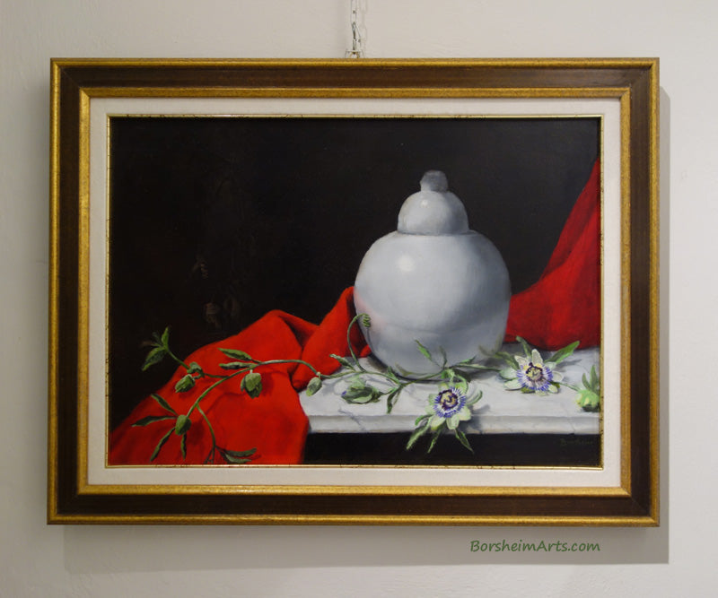
A bright red cloth sets the scene on this still life painting on a marble slab. There is a round white vase with lid that shows reflections of the red, as well as the passion flower vines that travel across the composition. In the dark background hangs a dying bit of the passion.
This original painting would look good in a kitchen or dining room or a study.
How she was made: by artist Kelly Borsheim

2018-08:
I enjoyed a previous painting project of a strong red, velvet-y fabric, a white round porcelain object, and a green thing. Trying another composition with a flower that grows around my area would be fun. Same red cloth (the idea is to understand how to paint an intense red without making it too light).
The round vase was an antique market find. The idea is to remember optical illusions: for the white highlight (the whitest white in the painting) to read well, the shiny white ceramic must be surprisingly dark. Also, the reflective surface will receive interesting shapes and colors from all of the surrounding objects.
The green is simply a complementary color that may act as a focal point.
Here you may see how I set up my still life composition in one corner of the room. I put the daylight-balanced light high up and manually moved the lamp around to decide where I wanted the light and shadows to fall upon my models. The black and dark grey scarf also took a lot of experimenting and tweaking to block/soften the light in just the way I wanted it.
A secondary problem was how to light the board on my easel so that I could see my work without changing the lighting setup on the models. Remember that this position of easel and the little cart that held my palette of paints will need to stay in the "middle" of that room for a while!

I primed the wood panel with a white true gesso so that when the oil paint goes transparent, what lies underneath it is a bright white... had I used any other color campitura to prep the "canvas," that may come to haunt me later as it reduced the contrast of the white object.
You see in these two images that I use charcoal to sketch out the design. Charcoal is well seen on a white background, does not harm the later layers of oil paint, and any drawing mistakes may be easily wiped away and re-drawn.
I put the first coat of a good red down so that it has the maximum amount of dry time as I work other parts of the composition. I want it to be more than just "dry to the touch" before I give that shape another coat of red. That will also need to be chemically dry before I begin to develop shadow areas of the red cloth.

Note in this studio shot that my point of view is very different from where I stood to take this image.

Just another view to prove to you how different cameras record light vs. how our eyes may discern much more nuance and tones. Here I chose the darker exposure so that you could see the shadow areas of the round bowl.

2018-10:
Here is an example of not ONLY painting what you see. But KNOWING that while the top left edges of the round white object SEEM to be a very white tone against the dark background, to avoid the feeling that the vase was "cut out and placed over the scene," the left edge needs to "turn" darker as the form curves away from the point of the highlight, which you really do not see in this photograph of the model. However, my eye sees where it is and it is NOT at the top left edge!


2019-12:
Well, I left this project for a long time to allow the blackish background and the red be chemically dry. I usually have many projects in various stages of completion. Sometimes, other things or people take precedence. Thus, I do not intend for you to think that paint must dry for almost a year. On the other hand, it does not hurt to have a longer time. Especially since I had placed the passion flowers where I set them up before they, too, dried.
In this image below, you see me using a white chalk this time (instead of charcoal) to decide the position and shapes of the passion vine that goes over or in front of the red cloth. I also sketched the dried vine in the background. The inspiration for this idea of the passing of time and the transition of life came from a famous still life: Basket of Fruit (c. 1599) by Caravaggio.

2019-12: My live flowers having died long ago, I moved my painting into another room to work on the flowers in a different way. I write this story in 2026 January and I no longer remember why I chose to sit down to paint. That is not my habit: I usually stay on my feet. While you may see a printout of a photo sitting above the painting, you may also note that the hand-drawn flower vines are not in the same positions as in the photo. Compositional choices.

2019-12: Some details of the passion flower vine paintings. The second image shows that I again moved back to the easel in front of the model. I wanted to check relationships. Mainly, I wanted the dried / dead vine in the background to recede a little bit into the shadows, as if implying the future, not throwing it in one's face.


Drawing in the shadows over the red cloth. I am very careful here not to disturb the red paint. Doing so would set me back several more months.


I really enjoyed painting the specific shape of those curling, long leaves that radiate from the connecting stem! I wanted to paint the passion flowers a bit loosely and with more texture to put in some life and interest. Also, I love the effect of the veins in the marble slab!
If you would like to add this still life painting of passion flowers or buy a gift for a cherished one, please contact me using the link below: