
Art News Rembrandt and Rubens National Gallery London Painting Tips
Borsheim Art Newsletter:
Art News Rembrandt and Rubens National Gallery London
by Kelly Borsheim copyright 17 November 2015CONTENTS:
- How long did that take you to make that?
- Rubens and Rembrandt in London
- Edge Comparison on Turner Paintings
- Geometry in the Figure in Stone by Vasily Fedorouk
- Calendar: Visit Galleries!
- Blog Highlights: Museum Hopping
- Subscription Info.
SUBSCRIBE FREE! [See bottom of each page on this site or click here.]
Dear Art Lover,
Perhaps one of the most common questions artists get asked is, “How long did it take you to make that?” Discussions among artists usually result in the ultimate response, “My entire life: Each thing I ever learned became the foundation of each new work.”
This is hardly fulfilling to the onlooker, though, is it? He just wanted a simple answer to satisfy a curiosity, not really the whole truth.
I hate this question because I have no easy answer. Most of the problem lies in that I rarely work on one piece at a time. And, no, I do not punch a time clock with each changing task or project. The other problem is that there is a difference between how long it REALLY takes to create a work of art and how long it takes just to EXECUTE the idea. For me, it happens in the brain for some indefinite amount of time, often longer than it takes to paint or even sculpt the baby.
However, I decided to take a stab at some time frames and hope to satisfy some curiosity. As smarts would have it, these works are still available at the time of this writing. Just contact me if you would like to make one or more yours (or give as a gift).
Subtle, huh?
Thank you for your interest!
~ Kelly Borsheim
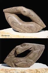
Pelican Lips: Started carving in March 2006, after I had already begun the Lips Series of stone carvings.
Finished: August 2006. More images and carving story here:
++++++++++++++++++++
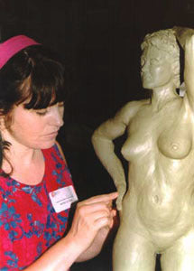
The Lookout started out in the Spring of 1999 as “Jennifer,” a full-standing 3-d figure half-life-size, modeled from life. In those days, in order to jumpstart my career, I was casting two bronzes at once in each edition: one for a gallery and the other for my own exhibitions. However, the foundry in Bastrop, Texas, did a terrible job on the mold and wax work. When I called to make an appointment to proof the wax, I was told that they had already begun the ceramic slurry mold and it was too late! The result was that one bronze had a much-distorted thumb and a few other things that made me unhappy. I was so new to the sculpting business that I did not know I could refuse such work.
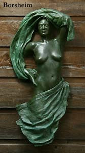
It was not until 2007 that I decided to cut her up and keep what I liked about her. I created a new composition, casting swirly fabric designs and then had them welding onto the existing figure. My new foundry needed a couple of months for this and John and I did the finishing work for this one-of-a-kind bronze. “Jennifer” became a wall-hanging as The Lookout. So… eight years in the making?
++++++++++++++++++++++++
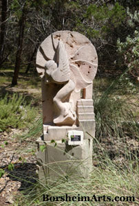
Stairway to Heaven, in Texas on exhibit at Carved Stone
Then you have Stairway to Heaven, an angel (and a stairway!) carved out of a PINK limestone from Texas. I started March 8, 2011 and finished in October 2011. During that same summer, I also finished the marble Gymnast and the writing and editing of my book, “My Life as a Street Painter in Florence, Italy” when I spent about two months living with my pregnant sister while her husband was in Afghanistan. Do you see the problem about “how long did that take you?”
Stairway to Heaven is now in a private collection.
+++++++++++++++++++++++++
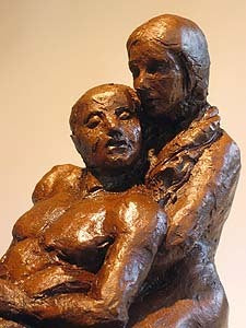
Comfort is a sculpture I made in clay [terra-cotta] that took about 2-3 days. I did not use models for this work. And while the Web page says that I made a mold of this for a future bronze edition, I do not think that I ever did it, as life got in the way. So this is a unique piece.
+++++++++++++++++++++++++
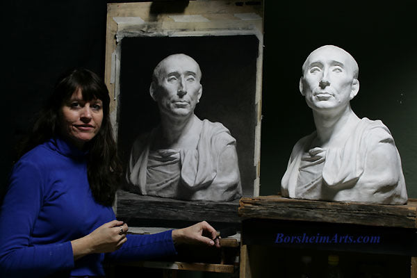
2008 fall: Niccolò da Uzzano:
Here I am with my charcoal drawing of a gesso (plaster) portrait sculpture. The gesso is a copy of the famous Italian sculptor Donatello's portrait of the banker of the Medici family, Niccolò da Uzzano. The original terra-cotta portrait sculpture is in the collection of the Bargello Museum in Florence, Italy.
For this project, I used the sight-size method of drawing [which means that all observations and judgements are made from about 2 meters from the art and LOTS of pacing the floor]. If you would like to learn more about sight-size, as well as see the finished artwork, click on the link below.
This work took me on average five hours, six days per week for about ten weeks. Niccolò is available for only $2600, or giclée reproductions are available for less than $500.
See the drawing process for Niccolò here:
https://borsheim-arts.myshopify.com/collections/charcoal-drawings
++++++++++++++++++++++++++++++++++
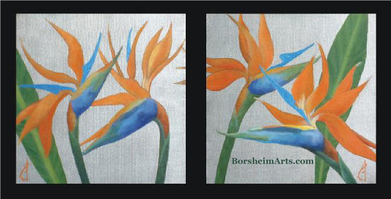
Birds of Paradise probably took me two-to-three afternoons, between stone carving times:
Available, the pair 12 x 12 inch thick-gallery-wrapped canvas with silver metallic paint.
################################
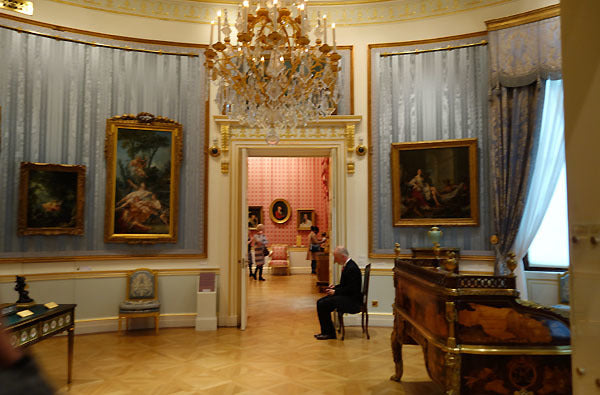
Rubens and Rembrandt in National Gallery London
One of the best perks of having free museums is that one does not feel so much pressure to “see everything” during a visit. Granted I do not live in London and cannot just “pop in” whenever I wish. However, I visited the National Gallery briefly four years ago and recently decided that I would not even try to see everything. Especially easy since in the three hours I had, I could not have done so!
Peter Paul Rubens and Rembrandt are some of the giants in the art world, but they are always worth a visit. Here are a few of the things I noticed this time around… with a Turner comparison thrown in at the end as well.
When I think of Rubens, it is often of his fleshy figures and his dynamic compositions full of diagonals. I was surprised to notice this visit some landscapes that seem just like bunches of others I have seen in museums. Most artists seem to change their skills dramatically. I think it is at some tipping point: they have learned their technical craft, and this time becomes the time to move beyond that to reach for emotional heights and significance. My favorite painter, Eugene Carriere, did much the same. His paintings seem almost generically like all others in his earlier days... and then... he exploded in quality! Wow. But, I digress. 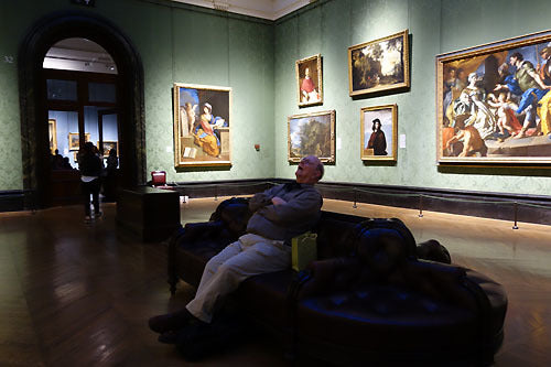
This may be a new symptom of Stendahl's Syndrome. hahahaaaa
And yours truly envies this man at times!

Peter Paul Rubens, "A Shepherd with this Flock in a Woody Landscape, c. 1615-1622
[The museum label said that this painting was a study for a larger work, The Watering Place. I prefer the "sketch" with its more interesting lighting and diagonals.]
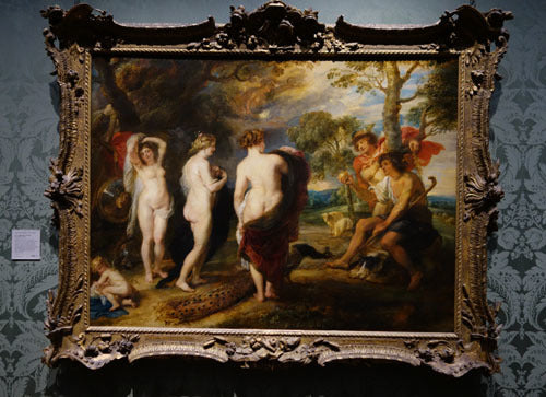
About ten years later, Rubens painted these figures that I think of more as his voice: The Judgement of Paris, c. 1632-1635, five years or more before his death in 1640.
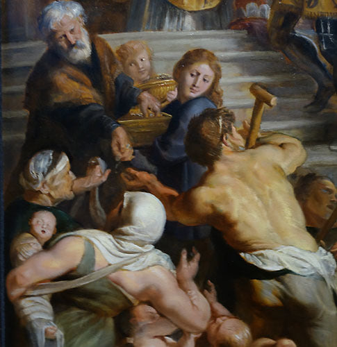
Have a look at this next oil painting, a triptych titled Sketch for the High Altarpiece, St. Bevo, Ghent. The sign in the National Gallery said that Rubens thought that this was "the most beautiful thing that he had ever done." However, I do not recall when he allegedly said this. The painting was executed around 1611-1612 and Rubens lived until 1640. This commission lost its steam when the commissioning bishop died in 1612.
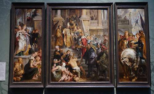
I like this work. Multiple figure compositions are not easy to design and he has done a good job keeping the eye interested while never losing sight of the real focus of the painting(s). However, I found it odd that very few of the figures appear to be by Rubens. I mean some of the crouching half-nude bodies in the foreground seem consistent for what he became known for. However, the rest look a bit flat and even cartoon-y. They do not seem like the same artist. Professional studios employed apprentices, though, and perhaps that explains it.
The soldier with the red cape and armour, Bevo, looks pretty flat and illustrative to me, although I like his gesture enough. He seems more comic-book-like than Rubens-like.
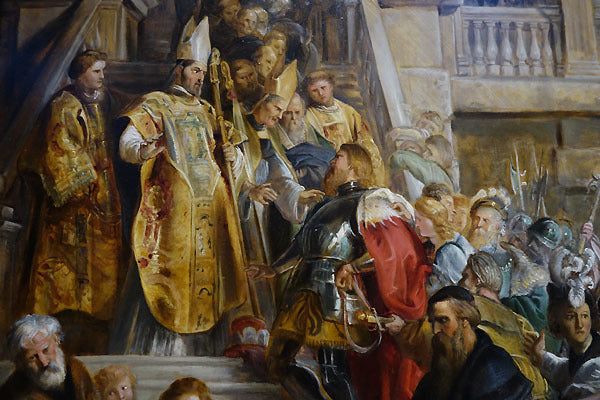
Oil Sketch for the High Altarpiece, St. Bevo, Ghent, 1611-1612 (detail of middle panel of a triptych):
Do the bodies and faces look to you as by the same hand?
Rubens Fleshy Figures in front, another artist did the figures towards the back?

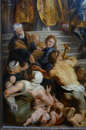
Peter Paul Rubens, detail of right panel in triptych
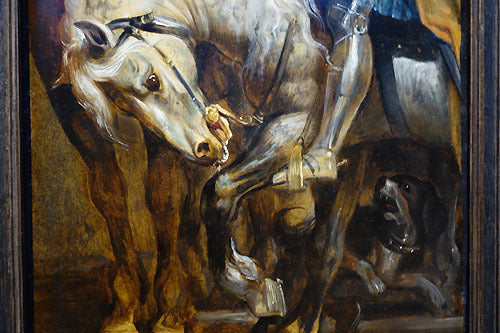
Oil Sketch for the High Altarpiece, St. Bevo, Ghent, 1611-1612
I enjoyed how the white horses were painted opaquely over the warm brown, transparent campitura (field color).
Rembrandt's growth
Above: A gallerist will tell you that he can tell which visitors are artists and which are collectors by how they look at the art. Artists walk up close and study each painting. Collectors tend to glance into the room and head towards the one that catches their attention, ignoring most of the others. Of course, we artists know that if the work does not carry well from a distance, no amount of detail or finesse will be enough to grab anyone's interest for long.
Another idea I heard reiterated in Florence is that "the eye moves first to the highest point of contrast nearest the center and then moves upwards." Okay. But when we try for a certain effect in light, high contrast is not necessarily the best way to achieve a feeling of emanating light.
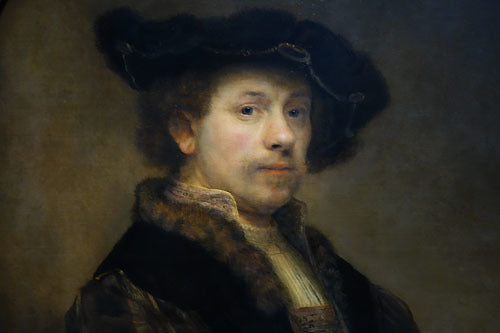
At least that was what Rembrandt showed me. Standing back and viewing the Rembrandts all in a row on that lovely slate blue wall gave me a much better understanding. I compared the two portraits of men. The second from the left is a self-portrait. The one on the far right is of another man. One might think that the high contrast of the flesh against a dark background would be the more dramatic one. However, I prefer the self-portrait.
From my vantage point, the almost totally black background makes the head feel cutout and not a part of its environment. Equally dark clothing made the man's head (and hands) seem to float in space. By contrast [ha!], Rembrandt's self-portrait has a diagonal beam of light shining down on the figure (yet still far darker than the head itself). And dark, but not too-dark clothing also aids in connecting the hands to the body that belongs to that head. The simple dark frame balances all that as well and enticed me to move in for a closer look.
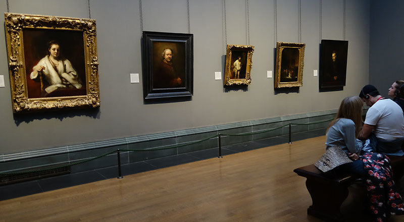
Portrait Comparison: Rembrandt's Edges
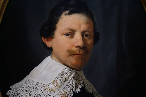
Now, let us take a look at two other portraits by Rembrandt. And why not? The National Gallery in London hung these together and made it so easy for us to examine them in this way!
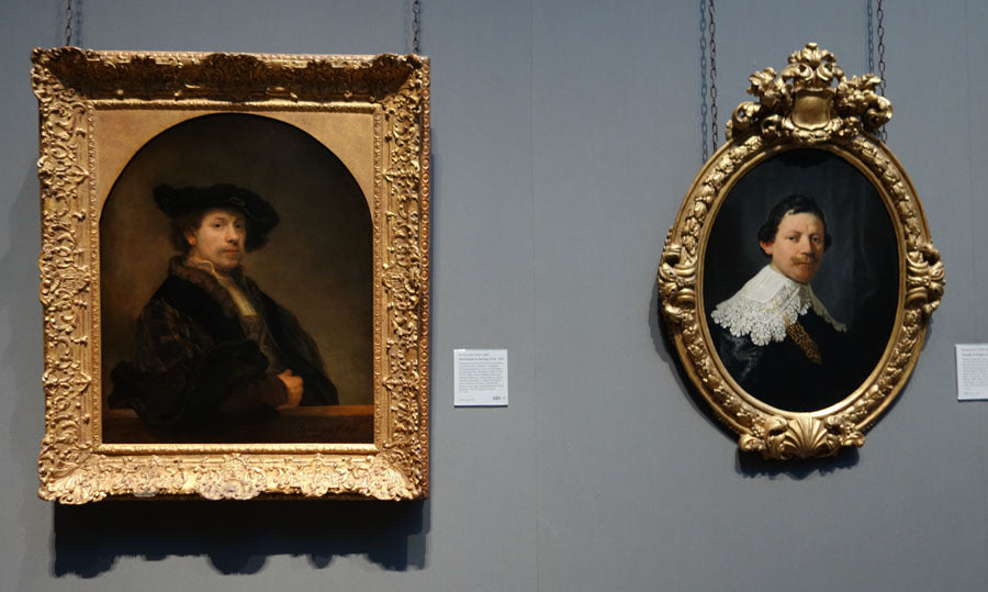
Above we have on the left: Rembrandt's Self-Portrait, painted in 1640 [the year of Rubens' death].
And on the right, is a portrait painted five years EARLIER (1635) of Philips Lucaszoon.
Both are beautifully painted. But Rembrandt has grown in leaps and bounds in those five years! Look at the edge quality in the self-portrait. Do you see the illusion of depth? Not all of the edges are softer, but the change of edge quality makes the face feel more dimensional, the hair wispier and actually growing out of the head instead of glued on it. (This is a slight exaggeration of Philips' head of hair, but do you see what I am getting at?)
Also, we see more "broken color." The flesh in the self-portrait has more variation between warm and cool colors. The pinks of the cheek and eye sockets is different from the orange of the lips. The same thing is happening in the background. Note the earlier portrait has almost a solid color blue-grey in the curtain behind the man. Other than changes of light, the hue itself seems not to vary much. Whereas, Rembrandt's self-portrait has a mottled mixture of blues vs. browns that gives a much more atmospheric quality to the painting.
And finally, while I admire paintings of lace, this large white shape under Philips head seems to compete and not compliment the man so much. But what are ya gonna do if the social norm of the time is to portray people in such getups? Oh, and Rembrandt's more romantic "vintage" fur and curving black hat are also wonderful composition tools. That hat makes me think of how sculptors deal with hair. Since we rarely control the light source falling on our sculptures, we tend to exaggerate some things to manipulate the light and help separate the forms. Rembrandt's wonderful hat not only has that graceful S curve showing off and topping off the design for the head, it also casts a soft shadow over the forehead and helps to emphasize the light on the side of the face that is closest to us. Really lovely.
Horizon Edge Comparison: JMW Turner Landscape Paintings
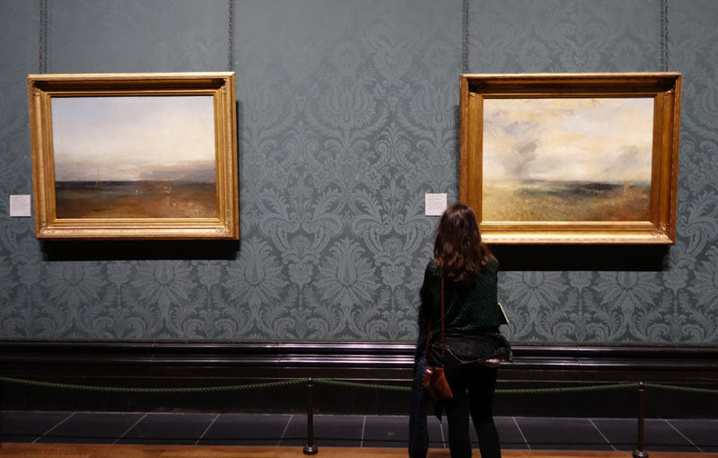
And by the way, aren't these wall coverings great? So, these are the sorts of things that I think about when I go to museums. I hope you enjoyed coming on this visit with me.
~ Kelly Borsheim, sculptor
######################################
Geometry in the Figure in Stone by Vasily Fedorouk:
Queen, a stone sculpture by my mentor and friend Vasily Fedorouk. I love the way that Vasily combines a geometric design with the human figure. He could carve anything!
If his sculpture interests you, please contact Vasily's family via his Web site at vasilyfedorouk.com
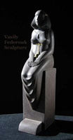
Queen
Stone
© Vasily Fedorouk
###############
Calendar:
I hope that you may visit one of the galleries that exhibit my work. My return to Italy has been full of not-so-wonderful surprises. Sadly, my future landlord’s wife died of cancer about a month or so ago and work on my house was not the priority this long sad summer (rightfully so). It was ok since I had rented a room in Firenze to accommodate my teaching schedule, but today I received a call that more time is needed on the house and I am making some adjusted plans. They do not include any exhibitions of my work. Boh!
However, these galleries have friendly people who love showing art, so have a look in real life:
See Don Elliott and Chuck at The Franklin Barry Gallery in Indianapolis and
Mark Palmerton in Norman, Oklahoma, at The Crucible Bronze Foundry and Gallery.
And please send me an e-mail if you would like to try to meet up in Italy.

The Merchant
Part of the "Passages - Morocco" series
pastel with charcoal
64 x 20 cm
Blog Highlights:
Some recent and interesting posts:
* London : The Wallace Collection (Part I)
* London : The Wallace Collection (Part II)
* London : Lord Leighton House Museum
* Minnesota Marine Art Museum
* ltaly: Museum of Sculpture by Libero Andreotti
* Italy: Sculpture by Mimmo Paladino
Inside The Wallace Collection, London, see the blog posts . . .
You may follow a variety of art topics on my blog, mostly travel and art:
http://artbyborsheim.blogspot.com
(This is a different subscription list than the one for this art newsletter.)
Thank you for sharing this journey with me. Thank you for sharing this newsletter with your friends and colleagues. Thank you. Please let me know if you would like to commission an artwork.
Peace,
Kelly Borsheim
17 November 2015
HOME / Newsletter Table of Contents
If you enjoy Borsheim Art News, please forward it to friends and colleagues. It comes to you about 6-8 times a year from a Tuscan, Italy-based American artist Kelly Borsheim.
----------------------
Give a Book Review:
Thank you for your interest and support in the book I wrote in the summer of 2011 about being a street artist in Italy. I was thrilled to receive such glowing feedback about how I had shared not only the art and the artists, but also something of the political environment regarding street art, interaction with the public and other street performers (my favorite chapter is the one in which I have invited children to join me on the pavement), as well as images of the Renaissance City herself.
The book is titled "My Life as a Street Painter in Florence, Italy." If you have read the book and would like to help in the promotion of it, perhaps you would consider writing up a short review for Amazon.com (or even send me a testimonial for my own site). Your review does not have to be fancy. The intention is to help other people get a better idea about what is inside and whether or not they may enjoy the read.
Just click here.
Scroll down to the section on Customer Reviews.
Click on the button to the right that says, "Create your own review"
Sign in and follow their guide.
or just buy from Amazon.com:
Order from Amazon (US):
My Life as a Street Painter in Florence, Italy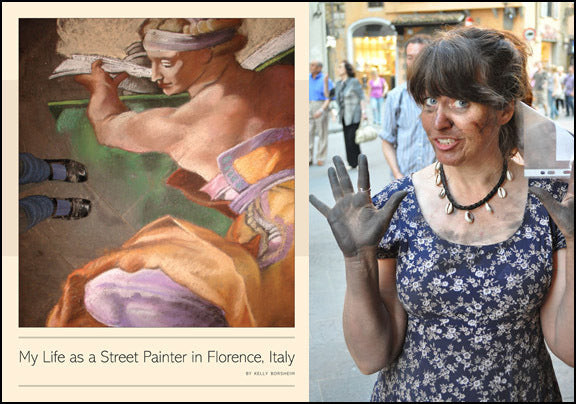
Above: Cover for book:
"My Life as a Street Painter in Florence, Italy"
by Kelly Borsheim
I have about 20 copies here with me in Italy, and some in North Carolina, so if you are also here, just write me and we will organize the rest.
HOME / Newsletter Table of Contents
Copyright © 2015 Kelly Borsheim
All Rights Reserved
Be the first to see new art: Subscribe to this newsletter below!